My original intention with this post was to write about beautifully designed books from past years but I admit I lost my way a bit. No matter, it was mostly an excuse to talk about a lovely book published last year called “Íslenskir fuglar” by Benedikt Gröndal.
Benedikt Gröndal was a very talented man. He was a poet, artist and a natural scientist. He was the first director of The Icelandic Natural History Society in 1889 whose main goal was to build a Museum of Natural History in Reykjavík. This guy did a lot more interesting stuff but I honestly can’t be bothered to translate it right now. Maybe some other day.

Benedikt Gröndal did some calligraphy too.
Anyway, last year Crymogea published Íslenskir fuglar which he finished in 1900 but it was never published. In this book he documented all birds seen in Iceland before 1900. He drew them, described them and wrote down what was known about each species at the time. This book is amazing. There are two versions of it. The normal one you can buy in book stores and the special edition. The special edition is bound in leather and comes in a wooden box. They only made 100 copies and each copy is numbered. It is, of course, pretty expensive.

Paper package.
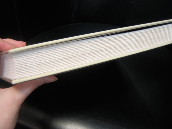
Edges.
The regular version is awesome too. It comes packed in paper and on the front is written in Benedikt Gröndal’s handwriting: “This book is my property and has nothing to do with the financial aid given to me by the Parliament”. They left in a lot of his own writing and even used his original calligraphed title page. When his own handwriting wasn’t used, they use a typewriter font so it keeps with the old manuscript feel of the whole thing.
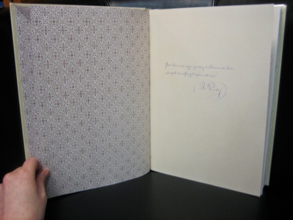
Lovely pattern.

List of birds.

No more caffeine for this owl.
The drawings are brilliant. They’re obviously not quite what they do these days but you can just feel the passion and enthusiasm he had for nature. Benedikt Gröndal was definitely a pioneer in this area in Iceland. For this one guy to sit down and meticulously document not only birds but also plants and mammals at a time when Iceland was…well lets just say things were pretty shitty. Good job Crymogea for publishing this book.

The Great Auk. Extinct since the mid-19th century.
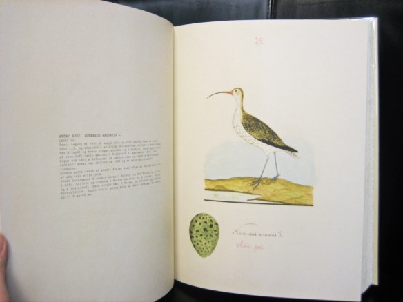
Eurasian Curlew.
Now when I decided to do this post I was quite optimistic about finding more brilliantly designed books published in Iceland in the past few years but I honestly came up a bit short. I must say the design of Icelandic book covers has improved dramatically in the last couple of years.
While desperately searching through Bókatíðindi I came across a couple of books whose popularity astounded me at the time. One such book is “Sumarlandið – framliðnir lýsa andláti sínu og endurfundum í framlífinu” or “Summerland – the deceased describe their death and reunions in the afterlife”. Yes that is the title and it sold out completely before christmas 2010, was reprinted in February 2011 and sold out again.
When it shot up the bestseller list in 2010 I remember briefly thinking that maybe we are a little bit weird as a nation. But it’s really not that surprising. We do have a reputation of readily believing all sorts of stuff. The book has a good message and was published by Guðmundur Kristinsson, a writer in his eighties who has quite a bit of experience in writing about these things. According to Bókatíðindi, it was published due to encouragement from beyond and when the dead encourage something I really do think it’s best to comply. And it all worked out. I’ll bet the big publishers were a bit annoyed at this surprise bestseller.
Another book that took me completely by surprise was “Og svo kom Ferguson…” or “And then came Ferguson”. It’s about Ferguson tractors in Iceland. When I first saw it I couldn’t help but wonder who would buy this book. Turns out lots of people did. If I remember correctly it also sold out before Christmas 2010 much to my amazement but in a cultural and historical context it all makes sense. Ferguson tractors were start of mechanisation in Icelandic agriculture. Before Ferguson tractors came to the country farmers used mostly people and small horses. As someone raised in the city what would I know about the importance of tractors? Interestingly enough a second book was published in 2011, this time about Farmall tractors.
Now I’d like to end this post on a low note because, why the hell not? The following is the worst book cover I’ve ever seen. It also came out in 2010 (clearly a weird year in publishing) and its name is Blowballs all over the place (it sounds even worse in English).

Share the pain, that’s my motto.
Yes, those are naked people with blowballs (such a silly word) as heads. And yes, this book is real. When we opened the box containing this wonder we honestly didn’t know whether to laugh or cry. It’s just oh so bad.


