So I had to make an ebook cover…

Making ebook covers is a relatively new task for designers and there haven’t exactly been many lengthy discussions on the topic. If there were any lengthy discussions I completely missed them which is entirely unsurprising. (I was probably too busy watching videos on Youtube of dogs running into walls and cats falling off furniture.)

I didn’t think of googling “how to make an ebook cover” until last week and my first advice is don’t buy a book about designing ebook covers if the book in question has an ugly cover. It’s just good sense. Otherwise googling ebook covers is good fun and I highly recommend it.

Continue reading

Major update to Studio Tendra’s Oz project

The Oz Reading Club has been updated with books seven and eight. And since I forgot to blog about books five and six, that means we’ve de facto got a massive four book update on our hands.

And we’ve reached a major milestone.

Yup. We’re more than halfway through L. Frank Baum’s Oz series.

What do you think about the covers Jenný has illustrated so far?

The Scarecrow

1. The Wonderful Wizard of Oz

The Scarecrow and Tin Woodsman

2. The Marvelous Land of Oz

Cowardly Lion

3. Ozma of Oz

Hungry Tiger

4. Dorothy and the Wizard of Oz

Dorothy

5. The Road to Oz

Toto the dog

6. The Emerald City of Oz

The Shaggy Man

7. The Patchwork Girl of Oz

Polychrome

8. Tik-Tok of Oz

What are self-publishing’s biggest pain points?

I’ve found that the more time you spend in a problem area the more you realise how many of your preconceptions were mistaken.

So, instead of just assuming I know what the pain points of self-publishing are based on my own experience, I figure the best thing to do is to simply ask people.

In general, publishers face two separate problem areas:

  1. Making the book as good as possible. This means making the text as good as possible (writing and editing) and making the product as good as possible (typesetting and design).
  2. Finding a paying readership for the book. (Selling, marketing, PR, events, etc..)

I’m pretty sure most problems self-publishers face fall into those same areas but I also suspect that their specifics and details are going to be unique to self-publishing.

And by self-publishing I basically mean any publisher with only one or two employees and who publishes only ebooks.

So, what are self-publishing’s biggest pain points? I’d really appreciate any answers, either in the comments below, twitter or, if you want, in email. (My email is baldur.bjarnason@gmail.com for those who prefer not to contribute in public.)

Continue reading

Studio Tendra’s grand and marvellous Oz Reading Club

Revealing our super-secret project

It’s time to announce Studio Tendra’s second major project: The OZ Reading Club.

The idea is simple:

We are going to release two ebooks in the Oz series per month until we’ve released all fourteen of L. Frank Baum’s original ebooks. Each ebook will have a new cover illustrated by Jenný and will be designed and formatted by me, Baldur.

You, if you are so inclined, are invited to read them along with us, two per month, as we release them. Every book page also has a comment thread where you can tell us what you thought of it. (Comments are moderated, of course.)

We’ll announce every new release here, on the OZ Reading Club site, on twitter, and on Google Plus.

The first two books are available now.

Continue reading

Books of Christmas Past

My original intention with this post was to write about beautifully designed books from past years but I admit I lost my way a bit. No matter, it was mostly an excuse to talk about a lovely book published last year called “Íslenskir fuglar” by Benedikt Gröndal.

Benedikt Gröndal was a very talented man. He was a poet, artist and a natural scientist. He was the first director of The Icelandic Natural History Society in 1889 whose main goal was to build a Museum of Natural History in Reykjavík. This guy did a lot more interesting stuff but I honestly can’t be bothered to translate it right now. Maybe some other day.

fuglar

Benedikt Gröndal did some calligraphy too.

Anyway, last year Crymogea published Íslenskir fuglar which he finished in 1900 but it was never published. In this book he documented all birds seen in Iceland before 1900. He drew them, described them and wrote down what was known about each species at the time. This book is amazing. There are two versions of it. The normal one you can buy in book stores and the special edition. The special edition is bound in leather and comes in a wooden box. They only made 100 copies and each copy is numbered. It is, of course, pretty expensive.

benediktgrondal-8

Paper package.

benediktgrondal-4

Edges.

The regular version is awesome too. It comes packed in paper and on the front is written in Benedikt Gröndal’s handwriting: “This book is my property and has nothing to do with the financial aid given to me by the Parliament”. They left in a lot of his own writing and even used his original calligraphed title page. When his own handwriting wasn’t used, they use a typewriter font so it keeps with the old manuscript feel of the whole thing.

benediktgrondal-1

Lovely pattern.

benediktgrondal-3

List of birds.

benediktgrondal-5

No more caffeine for this owl.

The drawings are brilliant. They’re obviously not quite what they do these days but you can just feel the passion and enthusiasm he had for nature. Benedikt Gröndal was definitely a pioneer in this area in Iceland. For this one guy to sit down and meticulously document not only birds but also plants and mammals at a time when Iceland was…well lets just say things were pretty shitty. Good job Crymogea for publishing this book.

benediktgrondal-7

The Great Auk. Extinct since the mid-19th century.

benediktgrondal-6

Eurasian Curlew.

Now when I decided to do this post I was quite optimistic about finding more brilliantly designed books published in Iceland in the past few years but I honestly came up a bit short. I must say the design of Icelandic book covers has improved dramatically in the last couple of years.

While desperately searching through Bókatíðindi I came across a couple of books whose popularity astounded me at the time. One such book is “Sumarlandið – framliðnir lýsa andláti sínu og endurfundum í framlífinu” or “Summerland – the deceased describe their death and reunions in the afterlife”. Yes that is the title and it sold out completely before christmas 2010, was reprinted in February 2011 and sold out again.

When it shot up the bestseller list in 2010 I remember briefly thinking that maybe we are a little bit weird as a nation. But it’s really not that surprising. We do have a reputation of readily believing all sorts of stuff. The book has a good message and was published by Guðmundur Kristinsson, a writer in his eighties who has quite a bit of experience in writing about these things. According to Bókatíðindi, it was published due to encouragement from beyond and when the dead encourage something I really do think it’s best to comply. And it all worked out. I’ll bet the big publishers were a bit annoyed at this surprise bestseller.

Another book that took me completely by surprise was “Og svo kom Ferguson…” or “And then came Ferguson”. It’s about Ferguson tractors in Iceland. When I first saw it I couldn’t help but wonder who would buy this book. Turns out lots of people did. If I remember correctly it also sold out before Christmas 2010 much to my amazement but in a cultural and historical context it all makes sense. Ferguson tractors were start of mechanisation in Icelandic agriculture. Before Ferguson tractors came to the country farmers used mostly people and small horses. As someone raised in the city what would I know about the importance of tractors? Interestingly enough a second book was published in 2011, this time about Farmall tractors.

Now I’d like to end this post on a low note because, why the hell not? The following is the worst book cover I’ve ever seen. It also came out in 2010 (clearly a weird year in publishing) and its name is Blowballs all over the place (it sounds even worse in English).

horror

Share the pain, that’s my motto.

Yes, those are naked people with blowballs (such a silly word) as heads. And yes, this book is real. When we opened the box containing this wonder we honestly didn’t know whether to laugh or cry. It’s just oh so bad.

Design highlights from the Icelandic book season

Gísli from Uppsalir

Like so many professional illustrators, I just happen to work in retail. My particular expertise is actually art supplies but the store I work in also sells office supplies and books. And since now is the most exciting time in Icelandic publishing, I’d like to talk about a few books coming out in this year’s Christmas Book Flood. During this time a lot of our effort goes into piling up books on massive tables, constantly changing the prices in attempt to have the best offers and flipping through “Bókatíðindi” (Bókatíðindi is a catalogue that lists all the books published this year) trying our utmost to memorise every single book.

There are some surprisingly good book covers this year and overall lovely designs. I just want to mention some that caught my eye. Now, I’m aware that most of you can’t actually read any of these books but at least you can look at the pretty pictures.

The first one I’d like to show you is called “Gísli í Uppsölum”. It’s a book about man most people over a certain age in Iceland know about. Gísli was basically a hermit thatlived on a farm in Iceland in almost complete isolation with only his animals as company and no technology. It was only in 1984 that he was introduced to the nation through a TV show called “Stiklur”. Now we have a book about his life, his family and the bullying he endured. Definitely a must-read in my opinion.

Not only is this book interesting but it also visually stunning. There are some gorgeous photographs featured in it and instead of piling them up in the middle like so many biographies do, they blend in beautifully with the text. They’re not printed on special glossy paper but instead simply printed on the same paper as the rest of the book.

First Chapter Spread

13th chapter: the unexpected guest

Gísli dragging hey

Last example from Gísli á Uppsölum

Now another book that caught my eye for it’s clever design is called “ð ævisaga” which pretty much translates to ð a biography. It’s the story of the letter ð, from its origins in the writings of Anglo-Saxon monks and how it became an inseparable part of the Icelandic alphabet. As far as letters go, I think ð is one of the more interesting ones but this book is definitely not for everyone (although I kinda want it because I’m easily swayed by pretty covers and ð is kinda interesting and why did we start using it in the first place? I actually do sort of want to know).

The biography of the ð

I’m always attracted to simplicity and the cover of ð ævisaga is just that. And I love their use of colour. From the bright green title page to the red chapter breaks and little bits of red text. It’s very visually accessible which makes sense since there are three graphic designers involved in the writing of the book (and one historian).

Ð examples

Ð in signage

Now these are the first two books I’d like to mention but I’d also like to quickly express my  delight in the republishing of some of my favourite Scandinavian children’s literature. Ronia (by Astrid Lindgren) was one of my favourite books as a child and one of the few children’s books I could read without crying in frustration (I’m looking at you Enid Blyton). And The Brothers Lionheart (also by Astrid Lindgren) is such a lovely, heartbreaking and traumatising story. A must read for all children.

They also republished one of Ole Lund Kirkegaard’s books. I’m not sure English speakers are familiar with him but he wrote some of the weirdest, wackiest books of my childhood. In one of his books a couple of kids draw a rhino on a wall and it comes alive. Another is about a boy who’s physically weak and gets bullied at school. He then meets a witch that makes him strong for a day so he gets a chance to show up his bullies only to become weak again the next day and life goes back to the way things were. I think it’s very important for kids to read books with a good message so I really do hope they continue republishing his work.

Designing the covers

One thing me and Jenný have in common with our parents is that we tend to talk about our work a lot. As a result we know way too much about linguistics and journalism (our mother’s fields) and psychology (which is what dad does).

It also means that we are very much aware of each others tastes and priorities when it comes to design, writing, and illustration. And one particular taste we share is a dislike – bordering on grumpy annoyance – of typical fantasy and science fiction covers. Those covers generally fall into two categories, with very few exceptions:

  • A photorealistic painting of pretty people in poses, often in some state of undress.
  • A photorealistic painting of a big impressive thing: spaceship, dragon, sword.

Both are very very common and very very boring.

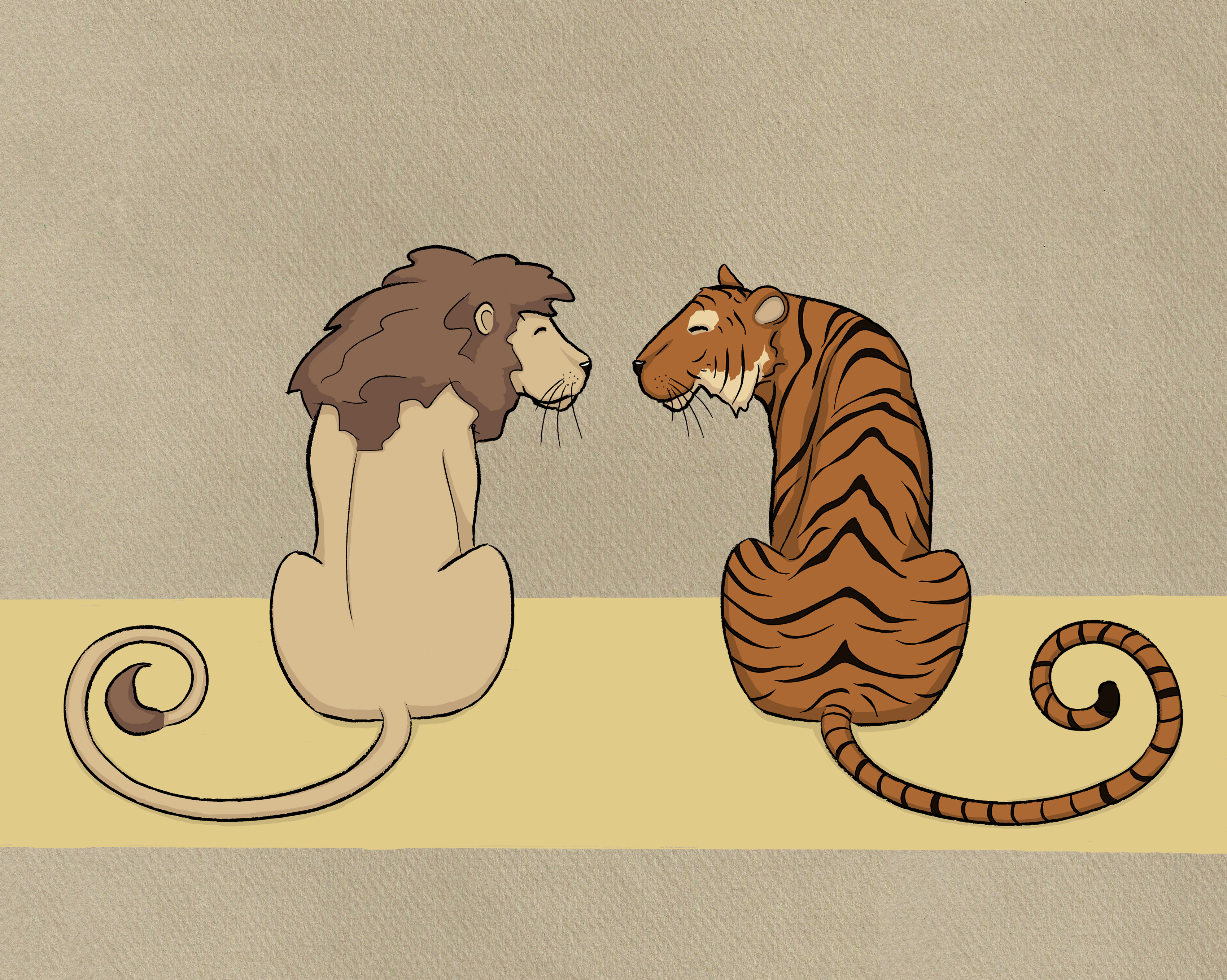
Now the original inception of the Knights and Necromancers series was based on a highly stylised etching of three ravens that my sister made more than a decade ago (I’ll write a blog post about that one of these days) so a logical thing to do would have been to base the styles of the covers on that print.

But that wasn’t the effect I wanted.


I wanted the covers to do two things:

  • Be entirely unlike a typical fantasy cover.
  • At the same time work as a fantasy cover.

One approach would have been to take the approach Penguin did in the sixties and seventies with cover designs based on a tight grid and often abstract images.

But I wanted a cover that implied a sort of sketchy roughness. I wanted it to be as rough and loose as the typical fantasy cover is realistic and detailed.

Jenný came up with the idea of charcoal on textured paper and after she’d done the first illustration it was clear that she had understood even better than I did exactly what it was that I wanted.

So I then gave her a list of what I wanted on the other covers along with reference photos. She generally ended up ignoring the references, except for the worm on the cover of book number three, which I think she completed in record time, after which she felt icky for days. (Like most Icelanders, she doesn’t like bugs, so drawing one was a bit of an ordeal.)


One particular thing has come up time and again as me and my sister have been working on Heartpunk and other Studio Tendra projects is that most people really don’t get why everything takes so much time.

Obviously, a lot of the lead time in big(ger) publishing is due to artefacts of their chosen process, many of which are not really applicable to an ebook-only outfit, but even that leaves out the one big reason why long lead times are actually a good idea when possible.

Namely, a longer lead time increases quality, more so than anything else you can do. Even without involving other people, freelancers, staff, or money, taking a little bit more time to think (or not to think, to get a bit of distance) is the one major thing you can do that will drastically improve the quality of your work.

Nothing improves a blog post more than letting it rest for a night before you publish.

And when you’re working on something more substantial, giving a work a few week’s distance between iterations can be the difference between a half-baked plot full of warped and broken sentences and something more solid.

(For example, the first draft of Knights and Necromancers 1: Days of wild obedience was completed over two years ago.)

The same applies to covers.

After Jenný had completed the initial illustrations it was my turn to figure out how to turn those illustrations into covers.

That’s where time comes into the picture. It went something like this:

I do a test design of a cover, which everybody in our informal feedback group likes, but to which I always say “eh, I don’t know’. I wait a few days and do another iteration, which everybody likes, but to which I say “eh, I don’t know’.

Then I do another—well, you can see where this is going. The League Gothic for the titles was the biggest surprise of all. I’m generally not that fond of it but it just clicked in place when I tried it for the main title. The aspect ratio was another surprise. I’d always envisioned much narrower covers but the overall style just didn’t feel right until I made them wider.


At this point, Studio Tendra has done eleven covers: the six books of the Knights and Necromancers series, four books in a series of annotated public domain books (which I’ll tell you all about in a few weeks’ time), and one in an aborted project you probably will never hear anything more about.

(So, yeah, we’ve got a pipeline of stuff to publish that’ll last us well into 2013.)

Jenný’s taken on more and more of the layout and design part of the cover creation process. The covers of our next project are almost entirely her work where there’s not much left for me to do except to make sure that there are no typos in the text.

And a few days ago we finished the last two covers in the Knights and Necromancers series. I haven’t added them to the Heartpunk website yet, but here’s a preview for the impatient among you.

Click to embiggen:

The cover of the fifth book in the Knights an Necromancers series, a charcoal sketch of a cat

Book number five

Knights and Necromancers 6

Book number six


And all of the book covers in a nice gallery thing: